| B A R E L Y B A D W E B S I T E |
|
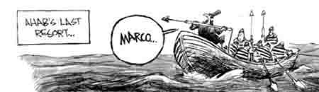
Marco Polo |
|
Non-Sequitur strip published in the July 23, 2001, edition of The Kansas City Star. |
|
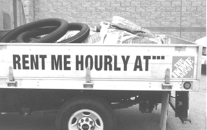
(If you don't get why this is funny, you need to know who Ahab was, what he was looking for, and what "Marco" means in this context.) There are many ways to render ellipses wrong, and we've all seen them way too many times. For example....here's one wrong way. But until July of 2003 I had never seen this wrong way.
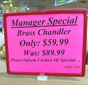
I took this photo at a lamp store in January of 2009. You can kind of make out the product it advertises in the upper left. Let me count the errors. First, with a little effort the underline could have been placed so it doesn't cut off the descenders in the "g" of "Manager" and the "p" of "Special." Second, it should be "Manager's," with an apostrophe. Third, the two colons make no sense and serve only to slow down the reader. Fourth, there's no reason to capitalize any of the words in the bottom line except the first one. Finally, of course, the mis-punctuated ellipsis is just dead wrong. Sheesh.
There's more about ellipses here. |
|
|
|
|
|
|
|
|