|
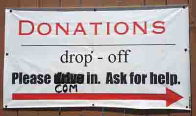
This photo shows the sign on the back gate of a charitable
organization everyone around here knows as The Free Bread Store.
Here's how to improve it. First of all, the apparently novice
composer of this sign has succumbed to the temptation to use the
ransom-note style; there are three fonts and two colors when it
should have been one font and one color. One font is less
confusing than three and one color is cheaper than two.
Second, the line between "Donations" and "drop - off" shouldn't
be there; it separates two words that go together.
Third, either that line isn't centered or the word "Donations"
isn't.
Fourth, there should be no spaces flanking the hyphen in "drop - off"; it should be
"drop-off."
Sheesh. |
